
NEWS
HOW TO EFFECTIVELY USE COLOR THEORY IN INTERIOR DESIGN
Color theory is a set of principles and rules that describe how colors interact with each other and how they can be effectively combined to achieve a harmonious and balanced appearance in interior design.
Color theory is based on the color wheel, which is a circle showing the primary colors (red, yellow and blue) and the secondary colors (green, violet and orange) that are obtained by mixing the primary colors. The color wheel also shows the complementary colors, which are those colors that are opposite each other on the wheel and can be used to create effective contrast in interior design. In addition to the basic colors, color theory also relies on other color properties, such as saturation, brightness and temperature. Saturation refers to the intensity of a color, while brightness refers to the amount of light reflected from a color. Temperature refers to the perception of a color as warm or cool.

Chromatic Circle
Es importante tomar en consideración una paleta de colores al momento de diseñar un espacio interior porque los colores tienen un impacto significativo en la apariencia, el ambiente y la sensación general del espacio e influye directamente en cómo se percibe el espacio y en cómo se siente la persona que lo habita o utiliza. Por ejemplo, los colores cálidos como el rojo, el naranja y el amarillo pueden crear un ambiente acogedor y enérgico, mientras que los colores frescos como el azul, el verde y el violeta pueden conformar un espacio más tranquilo y relajante. Los colores también pueden afectar la percepción del tamaño y la forma del espacio: los colores claros y brillantes pueden hacer que un espacio parezca más grande, mientras que los colores oscuros pueden hacer que parezca más pequeño y más íntimo.
De igual forma, éstos también pueden afectar la cohesión y la armonía en el diseño de interiores. Una paleta de colores coherente puede hacer que un espacio se sienta equilibrado y armonioso, mientras que una paleta de colores discordante puede tener el efecto contrario y hacer que un espacio parezca desordenado y caótico.

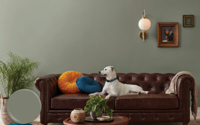
Proyecto Residencial TDC Apto 6, Valencia, Venezuela
How you can apply color theory when designing an interior space
Understanding the properties of colors
Before starting to design any space, it is important to have a basic understanding of the properties of colors. Primary colors are red, yellow and blue, and secondary colors are obtained by combining two primary colors. It is also important to consider the properties of saturation, brightness and color temperature.
Uses colors to create a specific mood and feel
Colors can have a big impact on the ambiance of a space. As mentioned earlier, shades of blue and green can create a sense of tranquility and calm, while shades of red and yellow can exude energy and vitality. When selecting colors for a space, it is important to consider the mood you want to create and use the right colors to achieve it.
Use different tones and textures to add depth
Use different tones and textures to add depth and dimension to the space. Lighter tones can make the space appear larger, while darker tones can make it appear more intimate.
Use colors to highlight key elements
Colors can also be used to highlight key elements in a space, such as an accent wall or a special piece of furniture. In these cases, contrasting colors can be used to highlight the element in question and make it stand out in the space.
Use the 60-30-10 rule

Proyecto Residencial TDC Apto 6, Valencia, Venezuela
The 60-30-10 rule is a useful guideline used in interior design to create a balanced color palette in a space. This rule states that 60% of the space should be a dominant color, 30% should be a secondary color and 10% should be an accent color.
The dominant color is the main color in the color palette and is used in the majority of the space. For example, the dominant color can be the color of the walls or the main color of the furniture. The secondary color is a color that complements the dominant color and is used in 30% of the space. This can be used in items such as curtains, cushions and other accessories. Accent color is a shade that is used in 10% of the space to add a touch of visual interest and contrast. This color can be bolder and more eye-catching and can be used in decorative elements such as decorative pillows, art pieces or accessories.
By following the 60-30-10 rule, you can create a balanced and harmonious color palette that looks cohesive and well-designed. This rule can be applied in different interior spaces, from living rooms and bedrooms to offices and commercial spaces. However, it is important to keep in mind that this is only a guideline and there may be exceptions depending on the space and the desired design style. At the end of the day, the most important thing is to create a color palette that reflects the design goals and preferences of the client.
Don’t be afraid to experiment
Finally, it is important to experiment with different color combinations to find the perfect color palette for a given space. Don’t be afraid to try different color combinations and see how they work together. Sometimes, the most unexpected combinations can turn out to be the most appealing and effective.
As architects and interior designers, it is essential to understand the properties of colors and how to use them to create beautiful, functional spaces that meet the needs and preferences of clients. Whether through research, education, hands-on experience or collaboration with other design professionals, it is possible to use color theory effectively to create attractive, balanced and cohesive spaces.
Ultimately, interior design is a creative and personalized process that depends on the needs and preferences of each client. By understanding color theory and applying it effectively, architects and interior designers can create unique, customized spaces that reflect the style and personality of their clients.
FIND OUT
WHAT’S NEWS

CASE STUDY: HOW A COMPREHENSIVE SPATIAL TRANSFORMATION IS EXECUTED
An analysis of the process behind delivering a comprehensive spatial transformation, exploring how diagnosis, design strategy, and project management translate an architectural vision from concept to execution.
WOMEN DESIGNING THE FUTURE: 5 CREATORS WHO REDEFINED INTERIOR DESIGN THROUGH MATTER AND FORM
On the occasion of International Women’s Day, we explore five designers who have shaped contemporary interior design through pieces developed for renowned European brands. A journey through their formal, technical, and cultural contributions to the evolution of global design.
2026 COLOR TRENDS: CHROMATIC PROPOSALS THAT WILL TRANSFORM SPACES
The 2026 color trends confirm that color has become a strategic tool within interior design. This article analyzes the proposals from the world’s leading paint brands and how to interpret them with intention to create spaces capable of delivering experiences that endure beyond trend cycles.
Subscribe to our Newsletter
To stay up to date and receive news about DG products, updates, and events.
