NEWS
DISCOVER THE COLORS THAT WILL BE IN TREND IN 2023
With the arrival of a new year, trend predictions are provided by industry experts, and 2023 will be no exception. One of the vital elements to consider within the interior design scheme is color, as it not only has a direct impact on the individual’s well-being but also provides an aesthetic identity to the space and influences the perception of it.
The big companies that study the application of color predict that vibrant and energetic shades will dominate the spaces of 2023, making way for exploration, fun, and vibrancy in a world that is still reformulating after a period full of news and surprises. Discover the colors that will reign in the rooms this year!
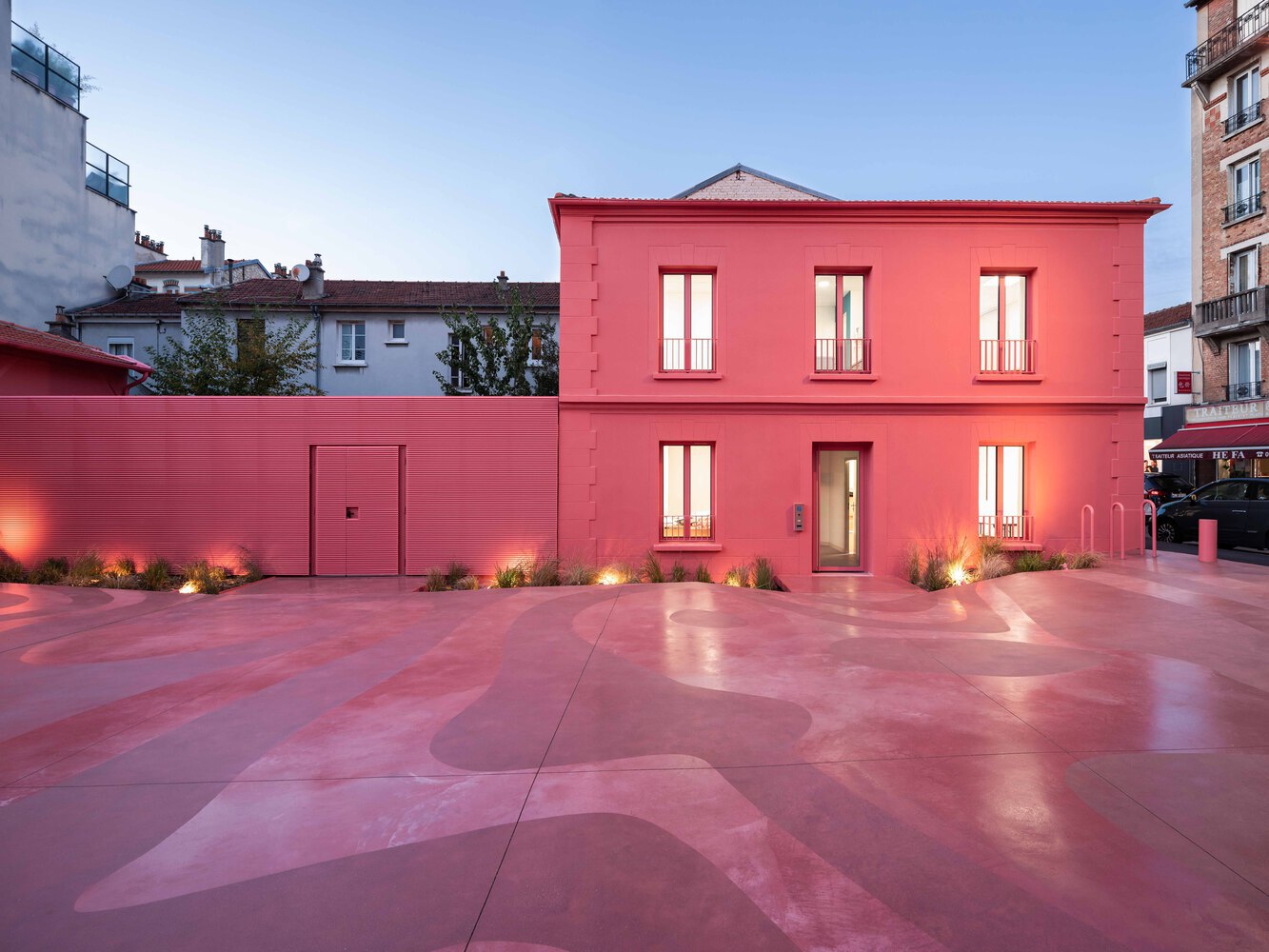
Viva Magenta – Pantone
This shade, belonging to the red family, was inspired by the “cochineal extract,” one of the most historically used stains to dye textiles, cosmetics, and food. Leatrice Eiseman, executive director of the Pantone Color Institute, classified this color as “bold and ingenious,” proposing its use for large spaces or in small doses, as in kitchen cabinets, shelves, or any detail that requires the strength and visual appeal of this shade.
Wild Wonder – Dulux
“Wild Wonder is potentially one of the most versatile Colors of the Year ever”: so, explains Marianne Shillingford, creative director of Dulux, describing it as a warm, soft, golden shade that radiates positivity. When combined with a neutral color, Wild Wonder promotes a sense of comfort and refuge, making it the perfect shade to be used in bedrooms or spaces where the purpose is relaxation and tranquility.
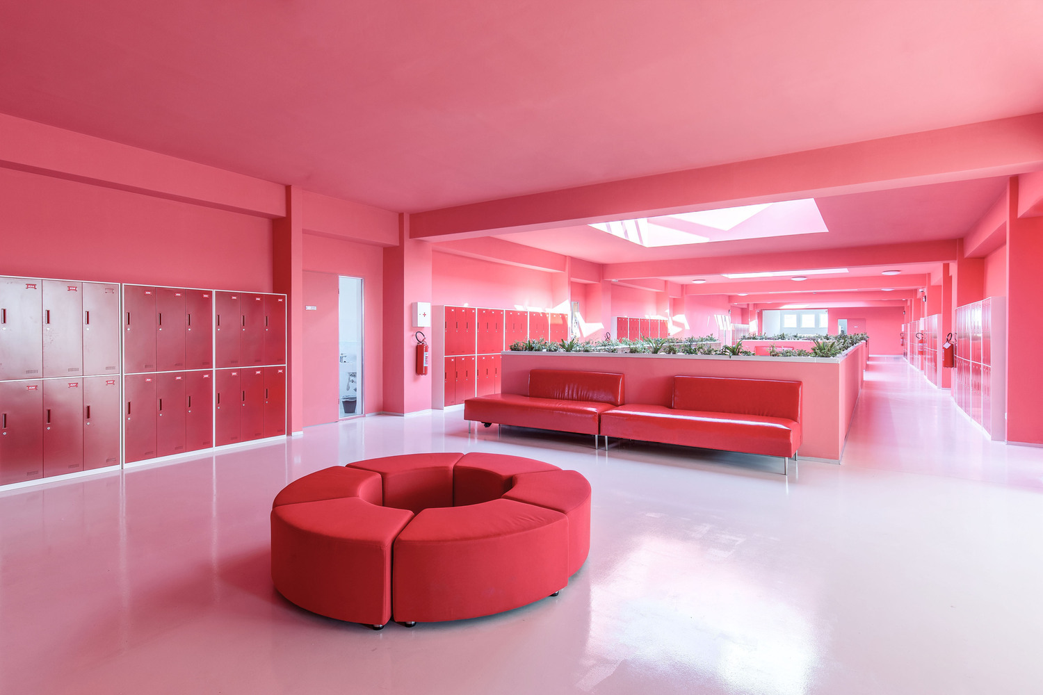
Raspberry Blush – Benjamin Moore
One of the shades that most represents the paradigm shift regarding the colors of 2022 is Raspberry Blush. This color is characterized by a warm and vibrant tone, instantly generating an impression of emotion or happiness. This trait makes it appropriate for exterior spaces, front doors, or furniture that dominates the scene. Andrea Magno, director of color development at Benjamin Moore, commented, “It is a charismatic color, which revives the senses.”
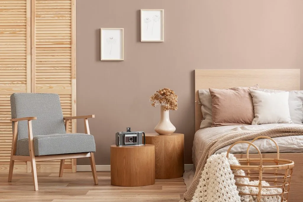
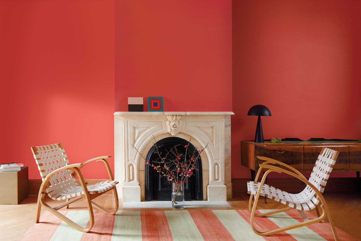
Redend Point – Sherwin-Williams
The Redend Point of Sherwin Williams consists of a desert-feel beige shade in counterpoint with an energizing earthy pink that feels like a doorway between two worlds. It is a proposal that references the notion of a “culture of empathy and care” and is defined by marketing director Sue Wadden as “ideal for any type of space, whether it is a restaurant, an office, or a multi-family building.” This shade exudes a sense of restoration that fosters a connection with ourselves and others.
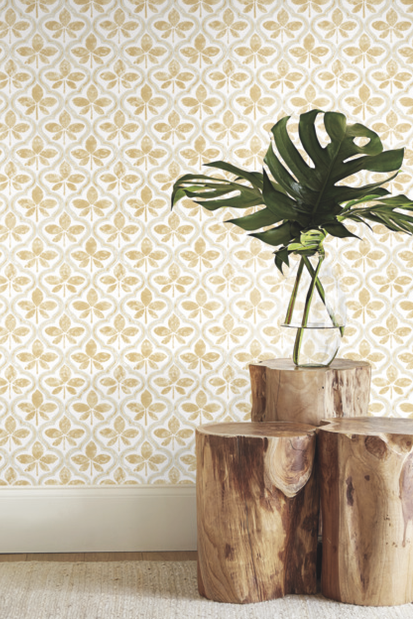
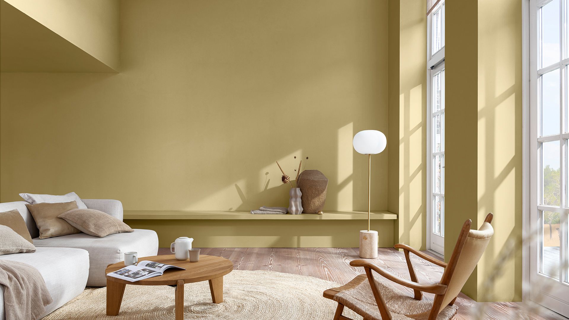
Amber – York Wallcoverings
Amber, by York Wallcoverings, is a yellowish shade influenced by the gemstone “Amber”; that replaces negative energy with relaxing positivity. This color is versatile, as it pairs perfectly with bold or neutral colors and is considered perfect for open, communal spaces. “It is a color that can be embraced regardless of one’s taste,” said Carol Miller, color and trend expert at York Wallcoverings.
FIND OUT
WHAT’S NEWS

CASE STUDY: HOW A COMPREHENSIVE SPATIAL TRANSFORMATION IS EXECUTED
An analysis of the process behind delivering a comprehensive spatial transformation, exploring how diagnosis, design strategy, and project management translate an architectural vision from concept to execution.
WOMEN DESIGNING THE FUTURE: 5 CREATORS WHO REDEFINED INTERIOR DESIGN THROUGH MATTER AND FORM
On the occasion of International Women’s Day, we explore five designers who have shaped contemporary interior design through pieces developed for renowned European brands. A journey through their formal, technical, and cultural contributions to the evolution of global design.
2026 COLOR TRENDS: CHROMATIC PROPOSALS THAT WILL TRANSFORM SPACES
The 2026 color trends confirm that color has become a strategic tool within interior design. This article analyzes the proposals from the world’s leading paint brands and how to interpret them with intention to create spaces capable of delivering experiences that endure beyond trend cycles.
Subscribe to our Newsletter
To stay up to date and receive news about DG products, updates, and events.
