NEWS
A STUDY IN COLOR
It is uncontroversial to say that one of the most important elements in an effective interior design relies on a meticulously designed color palette. Though the correct usage of color can be perceived as a combination of various subjective elements based on an individual’s experience and biology, there is still a fairly objective science behind many of these concepts.
In keeping with most subjects in the field of design there are some basic guidelines and rules established for a space’s color design, though ultimately, it’s up to the designer’s discretion. Below, we outline the fundamentals for the theory of color and the factors that must be kept in mind when choosing the colors that will compose your space.
THE BASICS:
When it comes to designing a visual aesthetic, color itself isn’t a universal constant one can rely upon, seeing as it is merely the brain’s interpretation of wavelengths in the visible light spectrum. As it is inherently subjective, the perception of color can be easily influenced by a variety of factors. Nonetheless there is a basic foundation from which we can develop a theory of color that can be used to determine patterns and designs. From here we can differentiate the key components of color, be it its hue (the actual color), brightness (proportion of black and white) or saturation (purity of color).
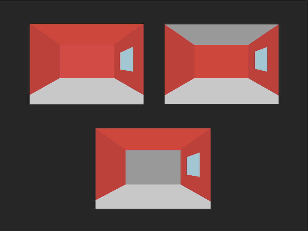
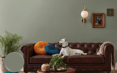
When attempting to define the color palette for a design, it can be difficult to interpret which colors go well together, especially with the wide range of hues and saturations that can come into play. For a good jumping off point, one can always take a look at the color wheel and rely on the traditional color schemes as seen below:
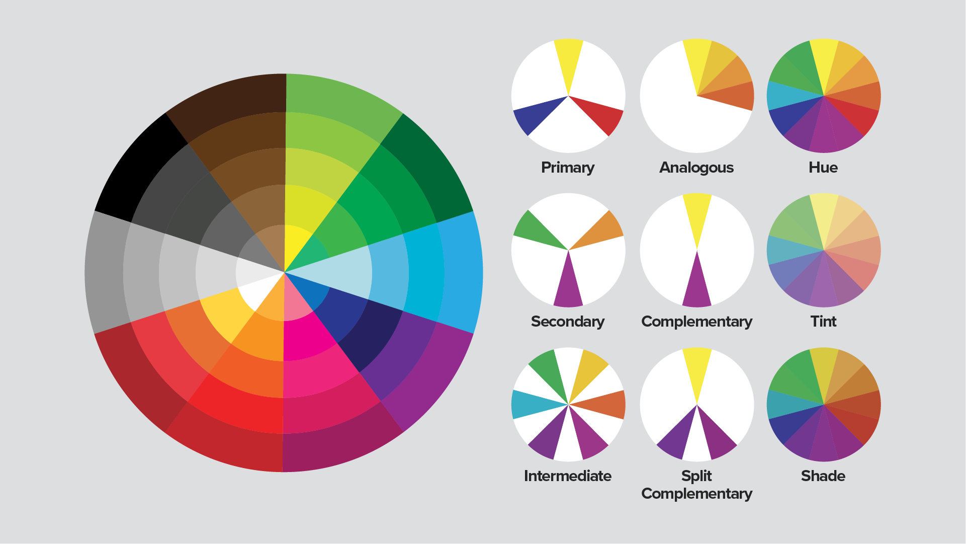
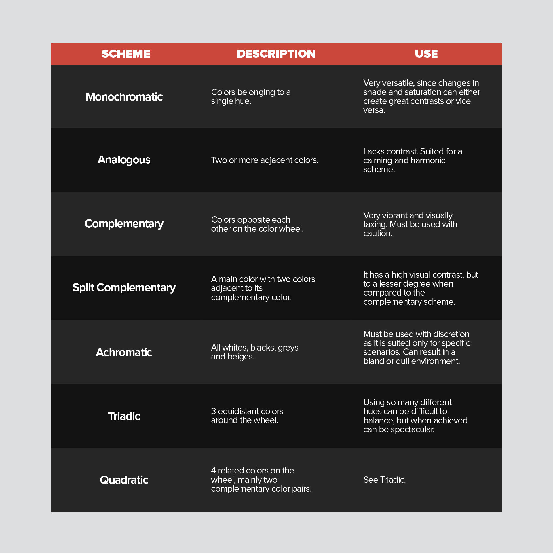
From these basic color schemes, a designer can then begin to experiment with different hues, shades, and saturations, and observe whether this palette complements the intended purpose of the design.
PLAYING WITH LIGHT.
Inarguably, the most important consideration when implementing a color scheme is a space’s lighting design. As mentioned before, a person’s ability to perceive color is quite a malleable thing, susceptible to various factors and influences, with light being the most significant of all. Determining the lighting system most suitable for your design’s color palette is essential to achieve the desired aesthetic.
As can be expected, a brightly lit room can make your colors seem brighter and more intense, and vice versa, though this isn’t the only property that must be kept in mind. The temperature of light sources (from 2700K to 5000K) can also have a significant effect on how colors are perceived, ranging from warm, yellowish light to cool bluish light. There needs to be a careful interplay between the lighting’s intensity and temperature to highlight the desired properties of the selected hues. Afterwards it becomes an exercise in determining which surfaces should be accented, what level of ambient lighting should be reached, whether or not there are contrasting sources of light coming into the space; all of which must be considered when attempting to create a specified color perception within a space.
PERCEPTION OF COLOR.
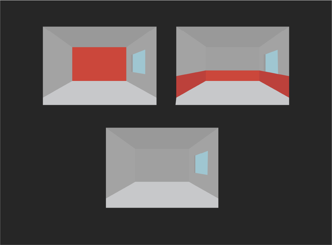
Carefully tweaking your lighting scheme is important to achieve your color palettes desired aesthetic, however even then your design might be influenced by other tangential factors. A good example is texture, which can completely alter the perception of a color scheme depending on whether a surface is shiny or matte. A shinier surface tends to reflect a higher quantity of light, resulting in a lighter perception of color, in stark contrast to more matte surfaces. As such, it is important to consider the physical properties of a space and its elements in conjunction with its lighting.
It is also possible to have your perception of color be influenced by the color scheme itself, as the juxtaposition between complementary colors can have compounded effects. Light and dark colors, as well as complementary hues, have their properties heightened when placed near their counterparts, which when used effectively, can be harnessed to the benefit of your design.

PERCEPTION OF SPACE.
The interplay between colors does not have to be solely based on a contrast between light and dark, however. It is also possible to unify a space or give it a feeling of movement by utilizing hue gradients along a surface. This strategy can be employed as a way of enhancing the aforementioned properties, as the additional feeling of progression can heighten the feeling of contrast.
COLOR PSYCHOLOGY.
Color’s effects aren’t only limited to pure aesthetics, seeing as they also are deeply influential to human psychology and physiology. Though some people might think we ascribe a superficial symbolic significance to color, it actually has a tangible effect on its audience. In one of our previous studies, we touched on the idea of how colored lighting can represent and evoke certain feelings and later established a hierarchy of color associations. These same principles can also be applied when dealing with a space’s color palette, especially when considering a design’s intent. The following table shows a more in-depth view of this hierarchy, with some of the most common associative colors:
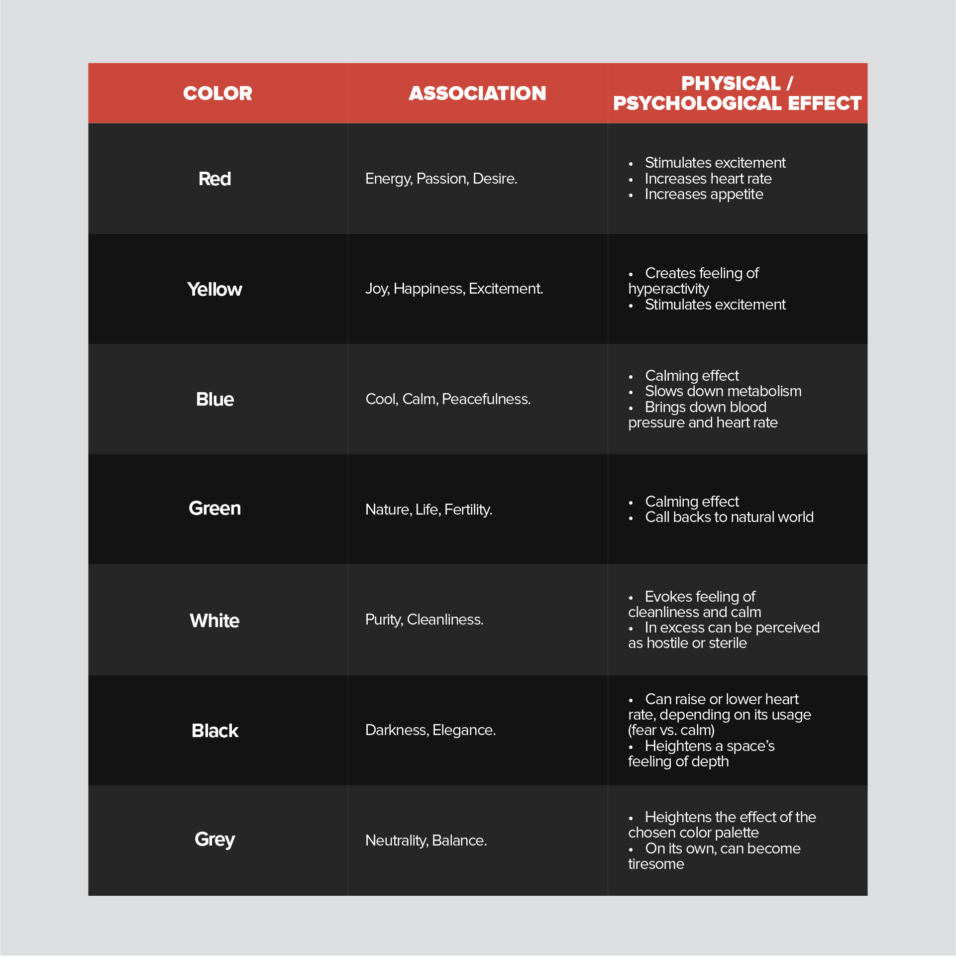
This is only a small selection, however, of the colors with the most pronounced physical and psychological effects. Overall, this topic of study is incredibly complex since there are no universal rules and these associations can sometimes be difficult to pull off. A small change in hue or in proportion can have a completely different effect (such as in yellow), and certain colors may have different cultural connotations, meaning that the effects of the color palette is deeply rooted in subjective taste.
Color and proportion.
Knowing what combination of colors to use and what kind of emotions they can evoke is essential for an aesthetically pleasing design, however all of this is for naught if the designer isn’t able to effectively proportion these colors. A typical rule of thumb utilized by designers is the “60-30-10 rule” which establishes a hierarchy of color, where there’s a dominant color, a secondary color and an accent:
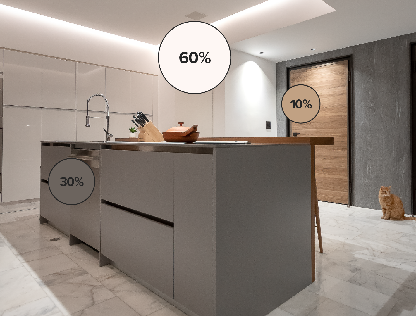
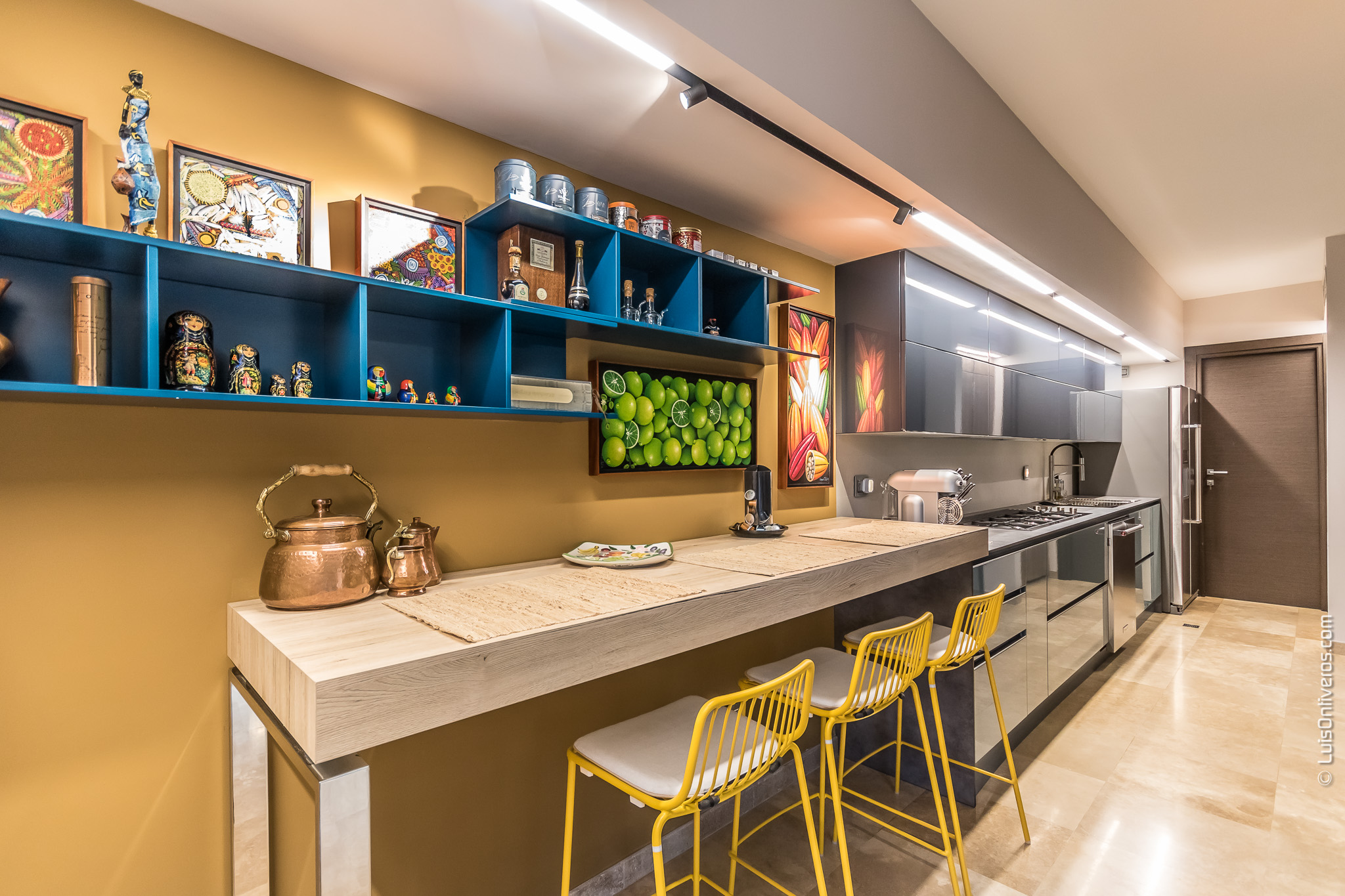
Residential Project CM19, Maracaibo, Venezuela
This of course, is a basic guideline and not a rule, meaning that a judicious designer can adjust it to their heart’s content. If desired, it is possible to include more colors or even play around with the different color schemes, for example dividing the primary or secondary colors in complementary hues:
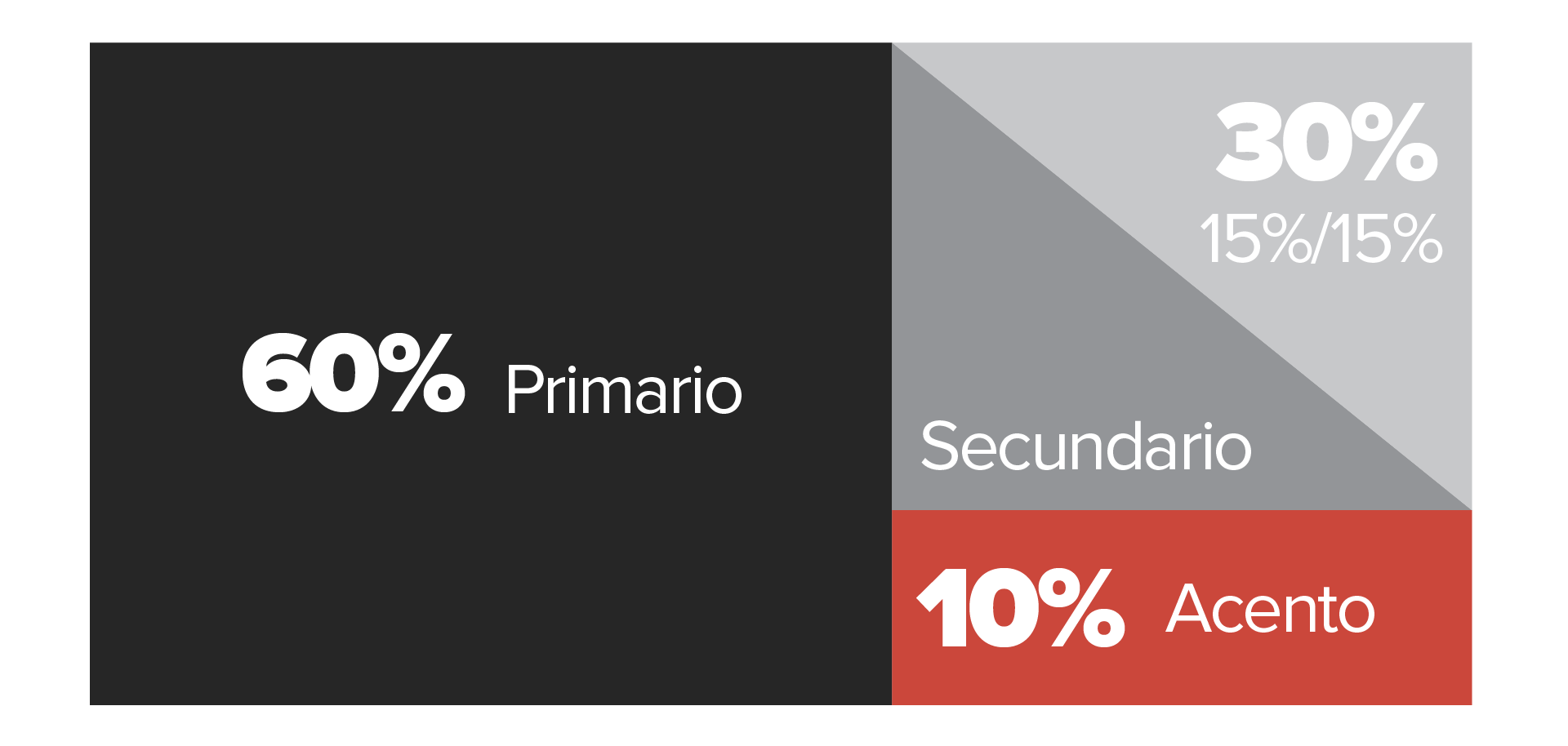
It is recommended however, to have a clear hierarchy of colors, meaning that even if you choose to play with proportions, it is essential to have an order of importance. A failure to do so, can create a visually muddled or confusing design, so tinkering with this rule should be left to the most adept of designers.
It is also necessary to understand which colors are suitable as primary, secondary and accent colors, as these are the ones that establish the narrative of a space. Seeing as each color evokes a specific emotion, the color hierarchy must be defined according to the design’s intent. Not only that, but certain colors must be used extremely sparingly in certain roles. A good example of this is in Pantone’s Color of the Year 2021, which features colors that can be challenging to implement. The Illuminating yellow in particular can be visually taxing, meaning that including it as the primary color of a space must be carefully thought out. Instead, most designers believe its potential lies mostly as an accent color.
FIND OUT
WHAT’S NEWS

CASE STUDY: HOW A COMPREHENSIVE SPATIAL TRANSFORMATION IS EXECUTED
An analysis of the process behind delivering a comprehensive spatial transformation, exploring how diagnosis, design strategy, and project management translate an architectural vision from concept to execution.
WOMEN DESIGNING THE FUTURE: 5 CREATORS WHO REDEFINED INTERIOR DESIGN THROUGH MATTER AND FORM
On the occasion of International Women’s Day, we explore five designers who have shaped contemporary interior design through pieces developed for renowned European brands. A journey through their formal, technical, and cultural contributions to the evolution of global design.
2026 COLOR TRENDS: CHROMATIC PROPOSALS THAT WILL TRANSFORM SPACES
The 2026 color trends confirm that color has become a strategic tool within interior design. This article analyzes the proposals from the world’s leading paint brands and how to interpret them with intention to create spaces capable of delivering experiences that endure beyond trend cycles.
Subscribe to our Newsletter
To stay up to date and receive news about DG products, updates, and events.
