In contemporary interior design, color can no longer be understood as a superficial decision or a purely aesthetic gesture. Today, it stands as a strategic tool capable of shaping experiences, influencing well-being, and building spatial identity. Every chromatic choice has the power to transform spatial perception, alter scale, enhance light, and generate emotional responses that directly impact how a space is lived and inhabited.
This is why the annual Color of the Year selections by color authorities such as Pantone, Benjamin Moore, Sherwin-Williams, Behr, Valspar, and Dulux go far beyond visual trend forecasting. These choices are grounded in deep research that examines global social, cultural, and emotional shifts, functioning as a barometer of the moment we are collectively experiencing. Understanding these selections allows designers to anticipate new ways of living and to design with greater intention, coherence, and long-term relevance.
At DGLA, we do not approach these trends as fleeting fashions, but as conceptual inputs that help us design purposeful spaces. For this reason, this article compiles and analyzes the chromatic proposals of the world’s leading color authorities to build a strategic map for 2026—a guide that allows designers to navigate color with sophistication, critical judgment, and a contemporary vision of interior design.
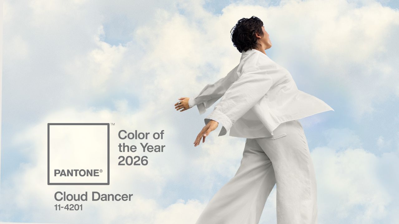
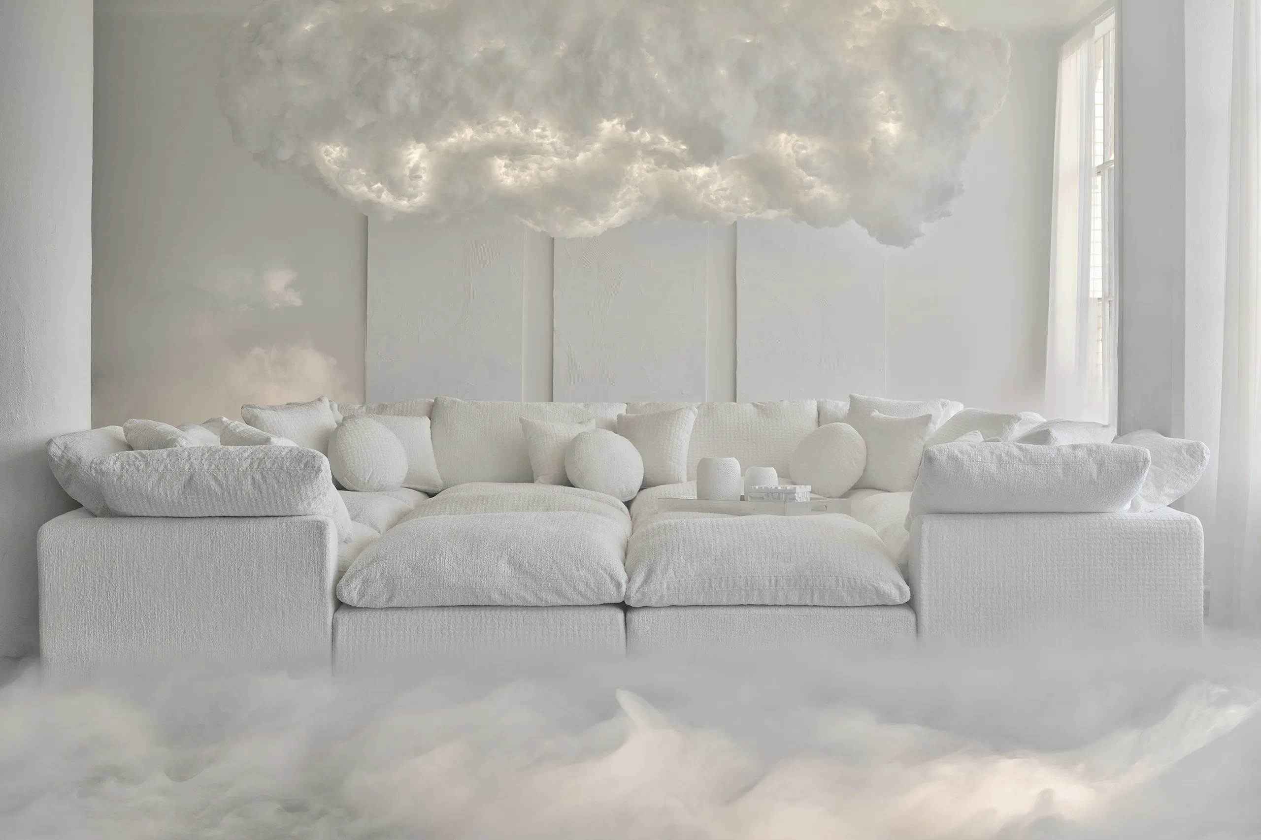
Pantone 2026: Cloud Dancer and the Sophistication of Silence
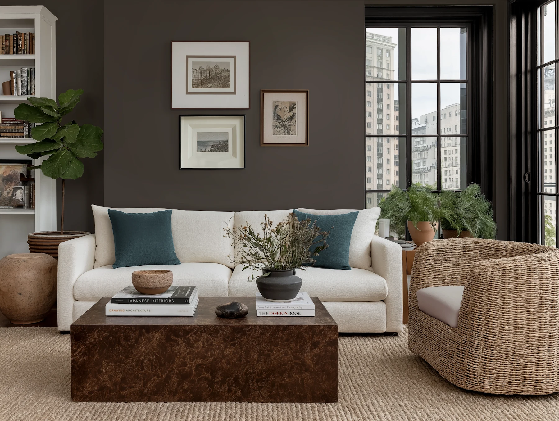
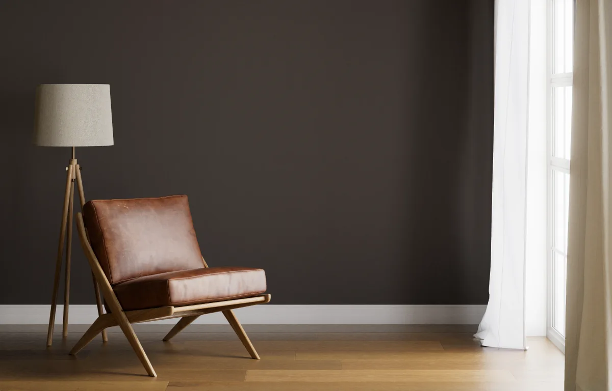
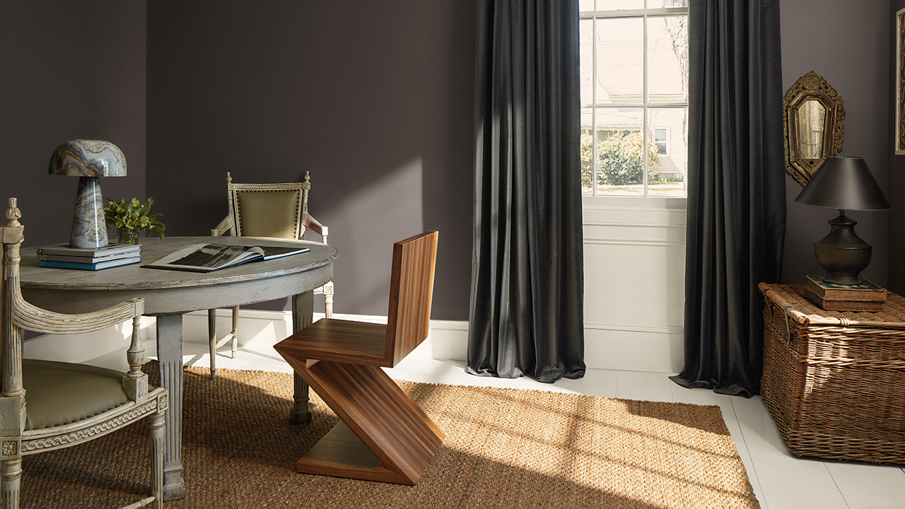
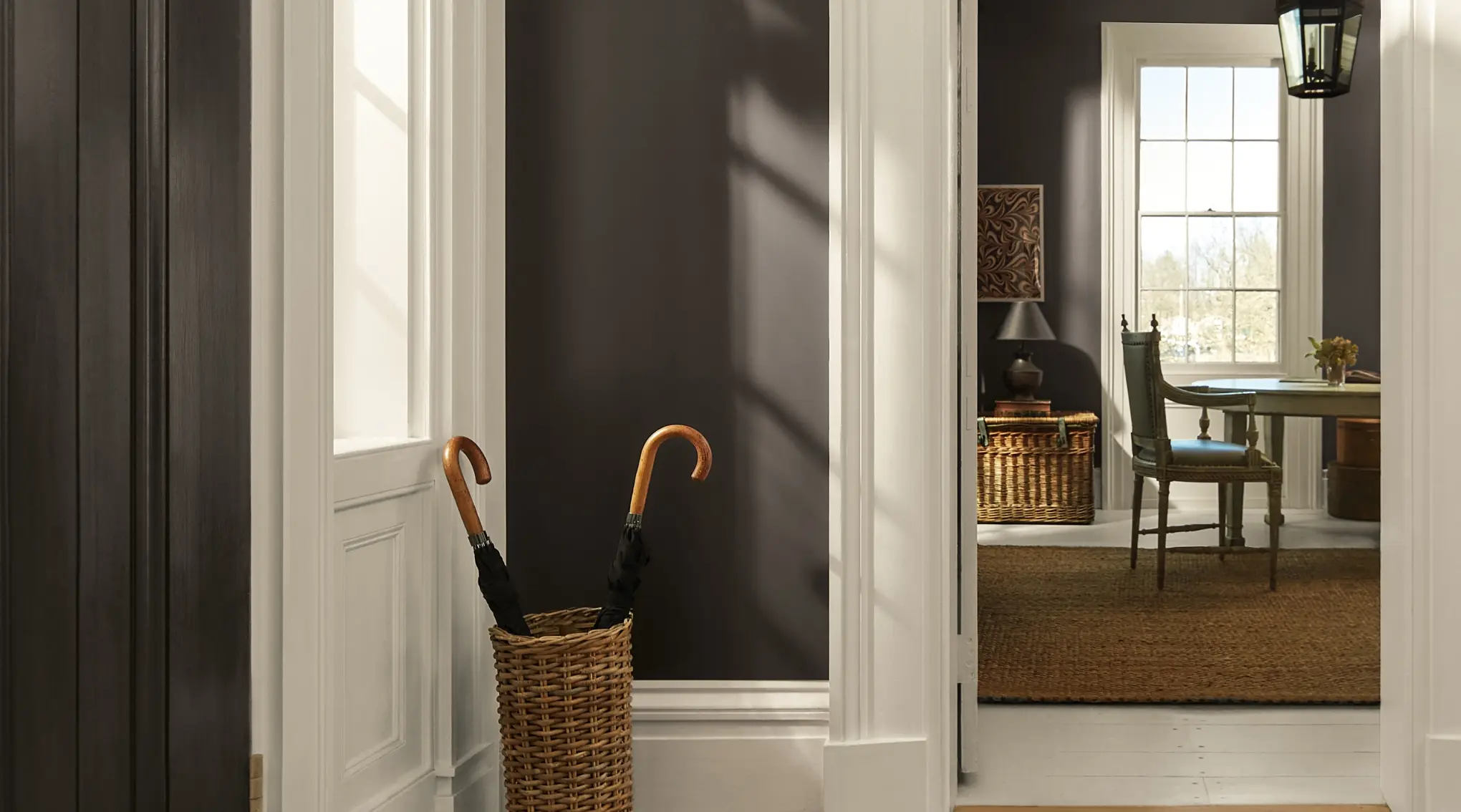
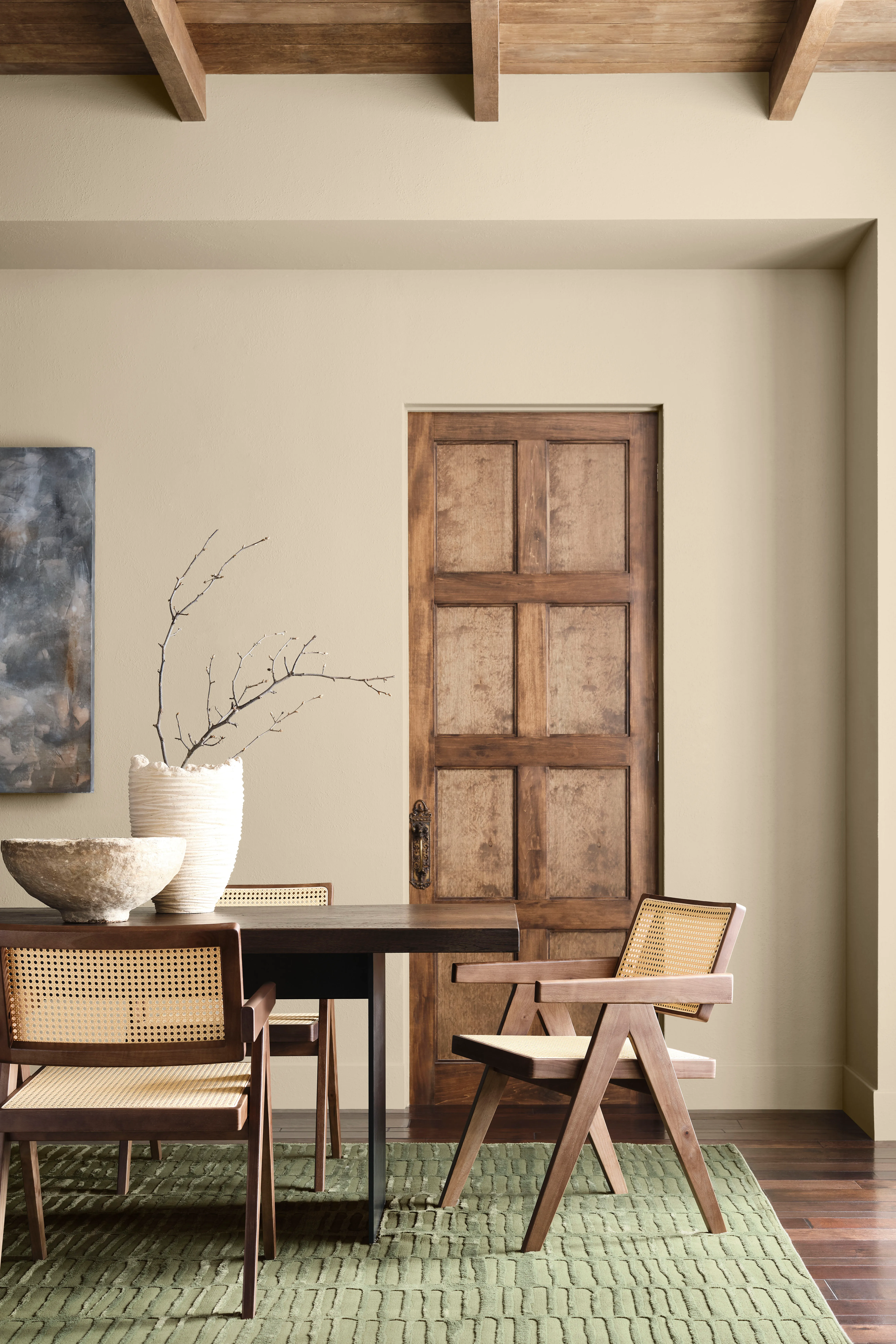
Benjamin Moore 2026: Silhouette and the Return of Elegant Depth
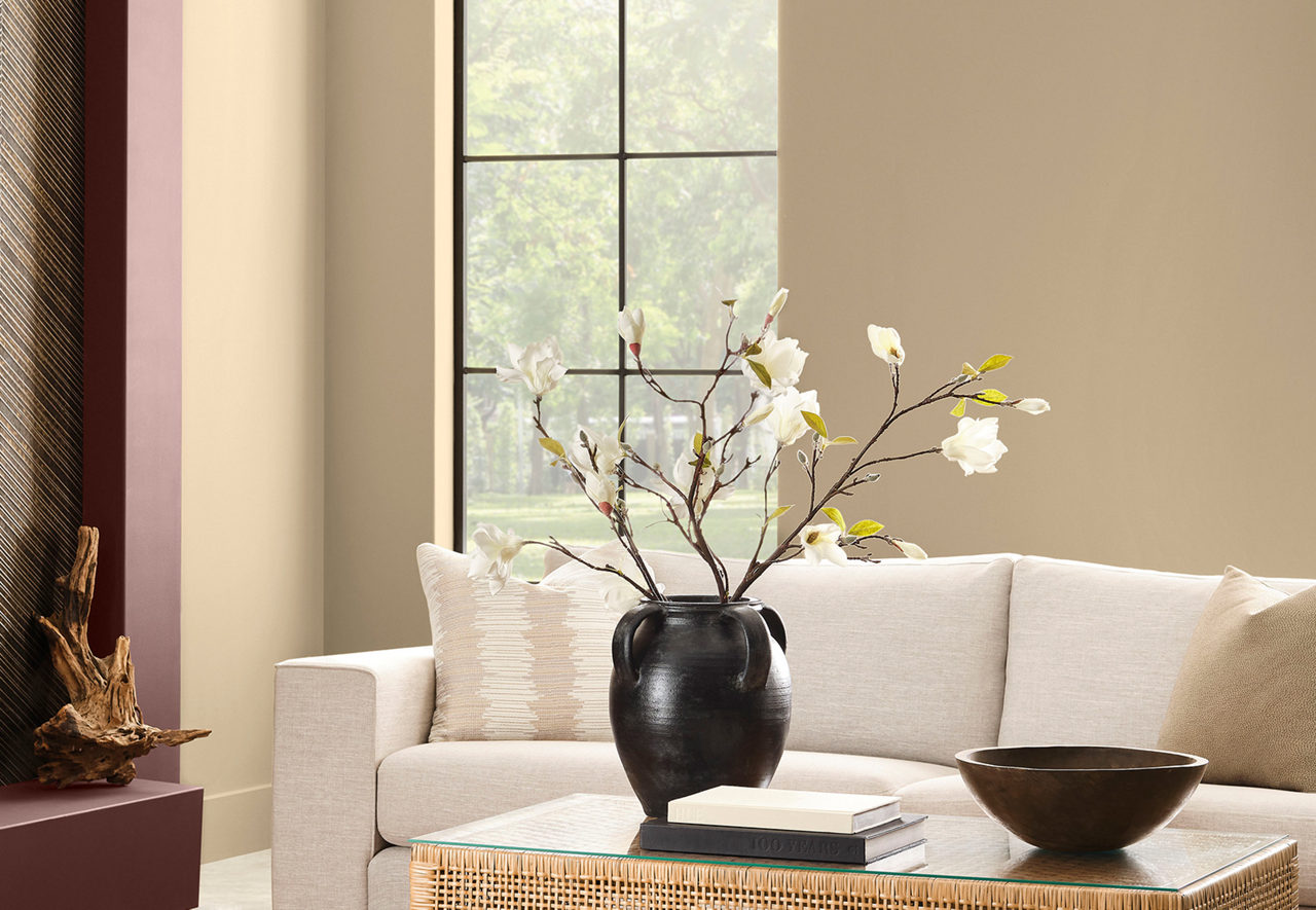
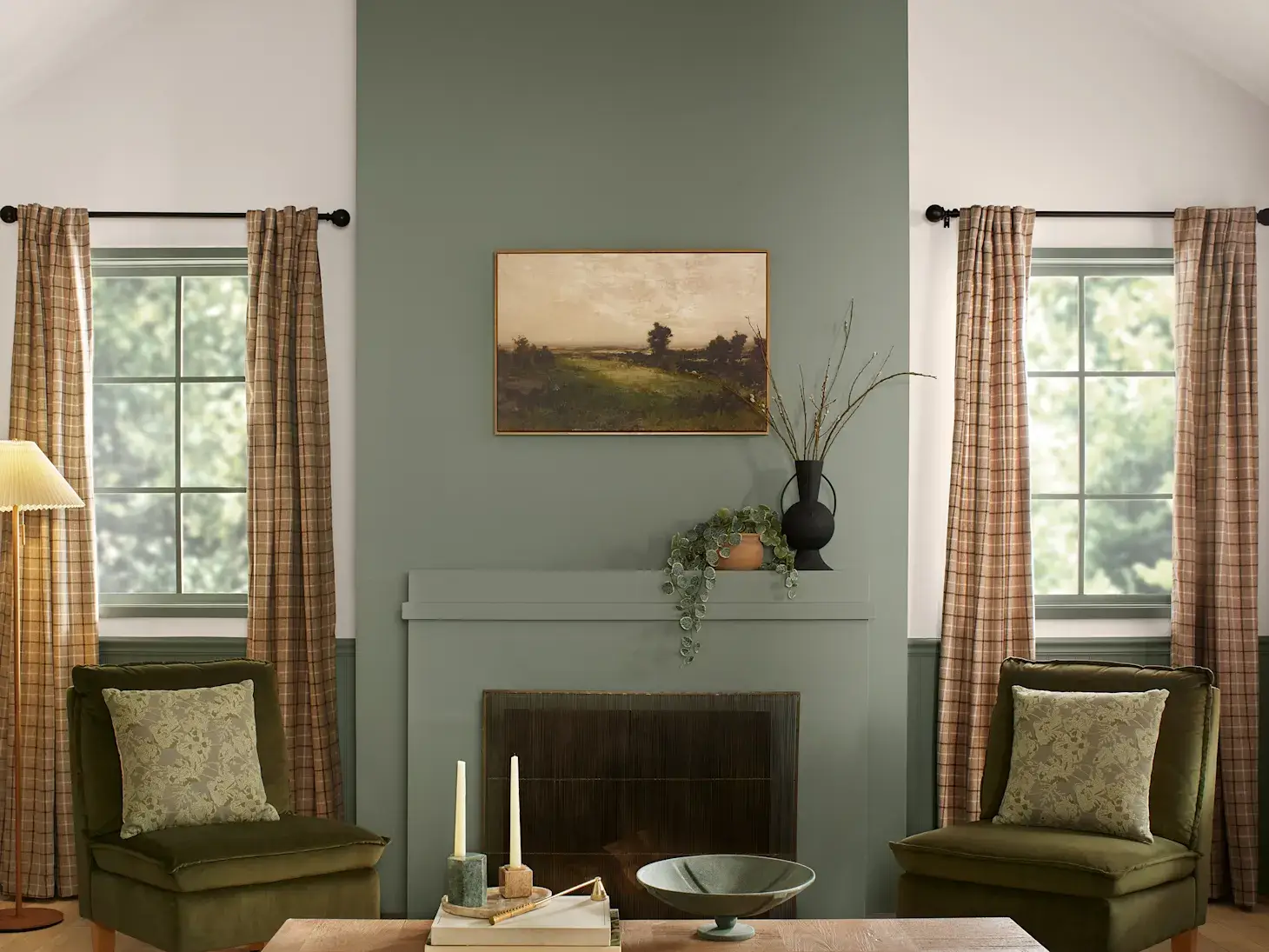
Sherwin-Williams 2026: Universal Khaki and the New Conscious Neutral

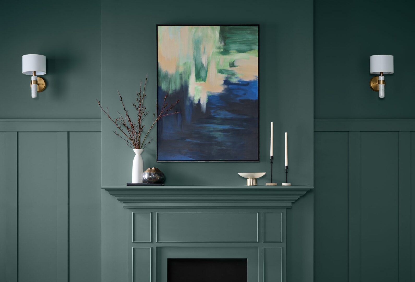
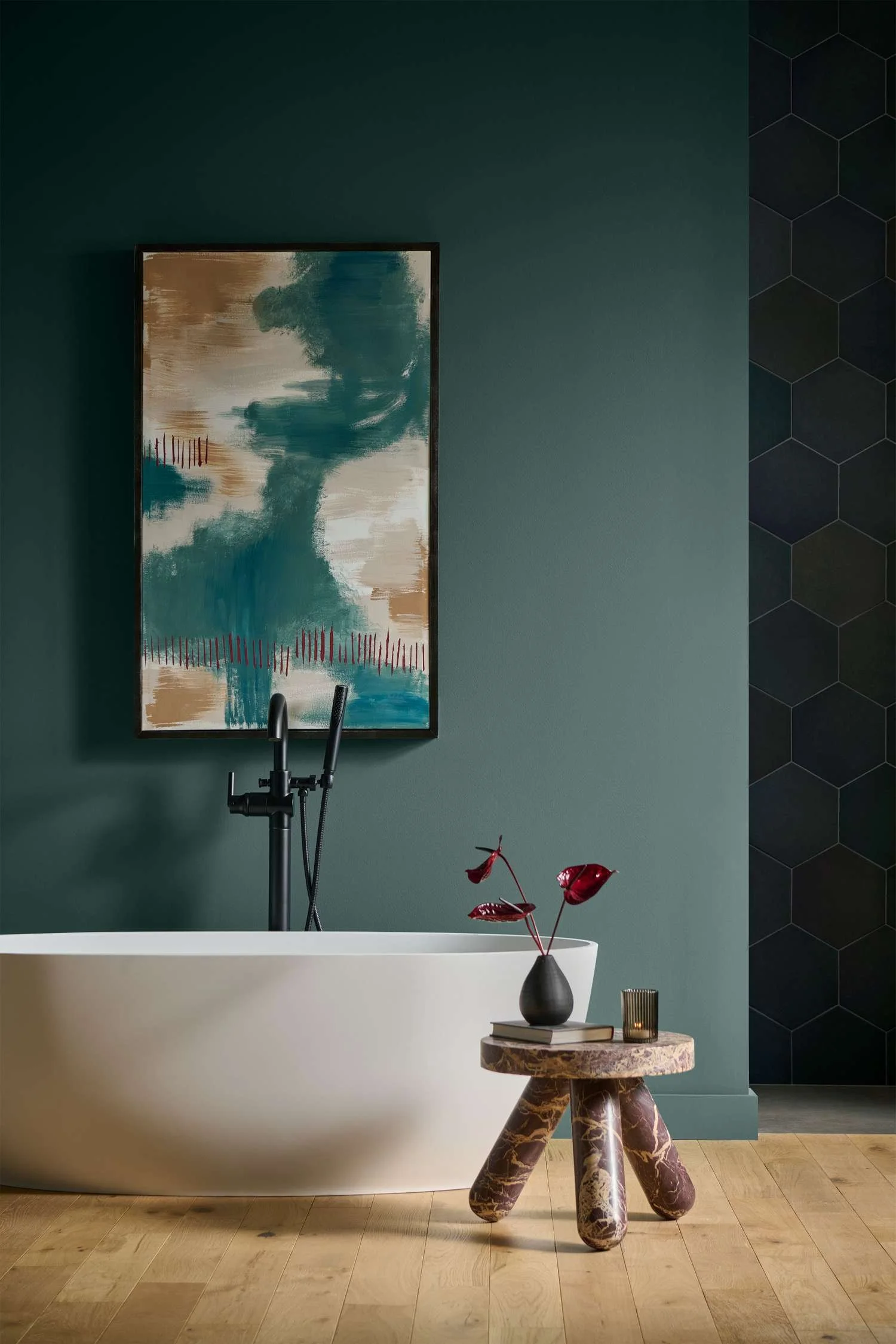
Behr 2026: Hidden Gem and the Emotional Power of Immersive Color

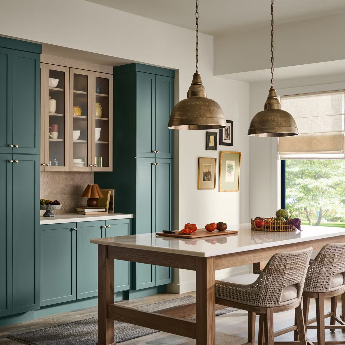
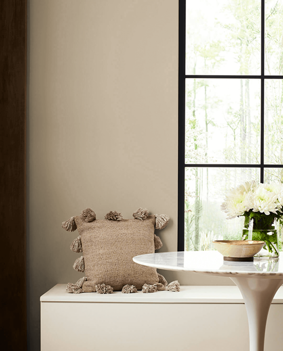
Valspar 2026: Warm Eucalyptus and the Sophistication of Comfort

In spatial perception, this tone acts as a visual embrace. Its presence reduces tension, invites pause, and generates a sense of home that is particularly valuable in high-end residential projects. It is a color that does not seek to impress, but to make people feel at ease.

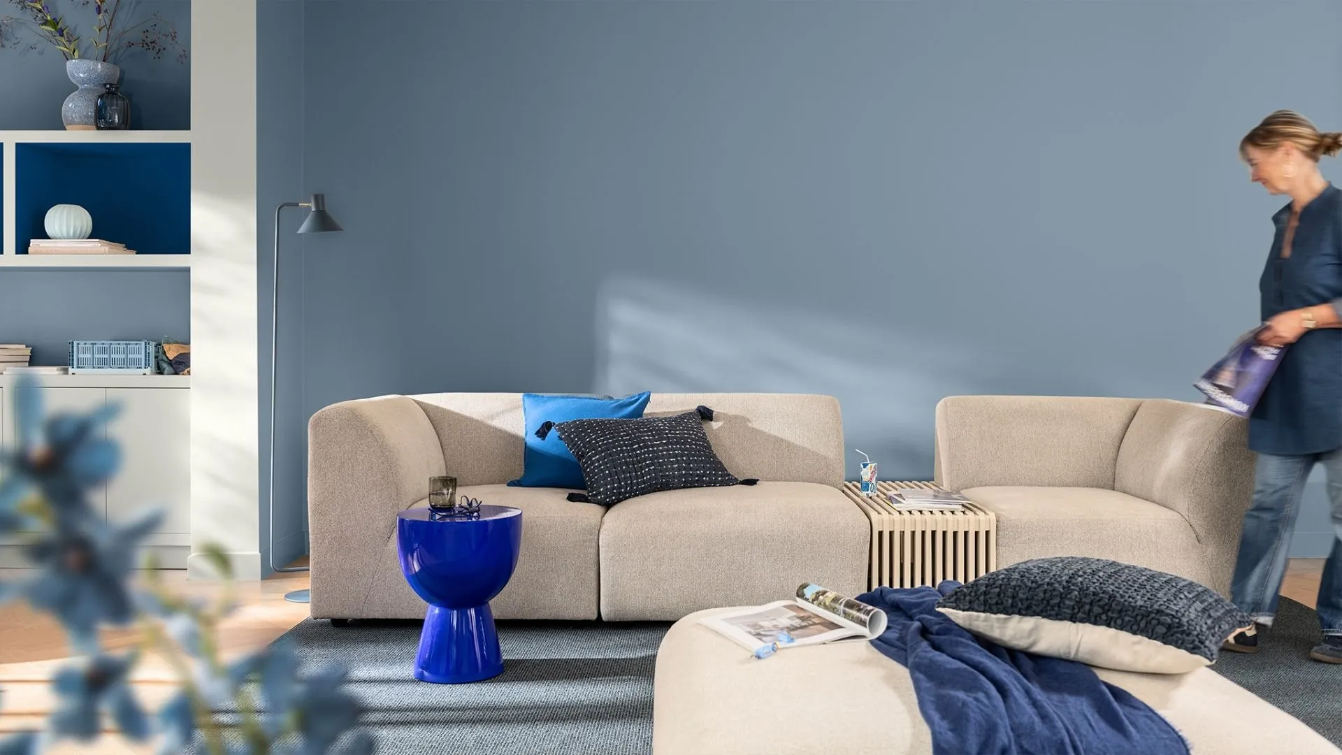
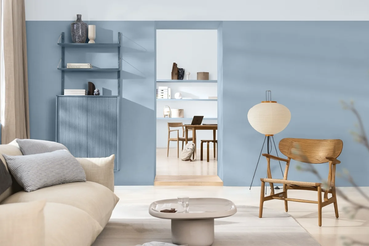
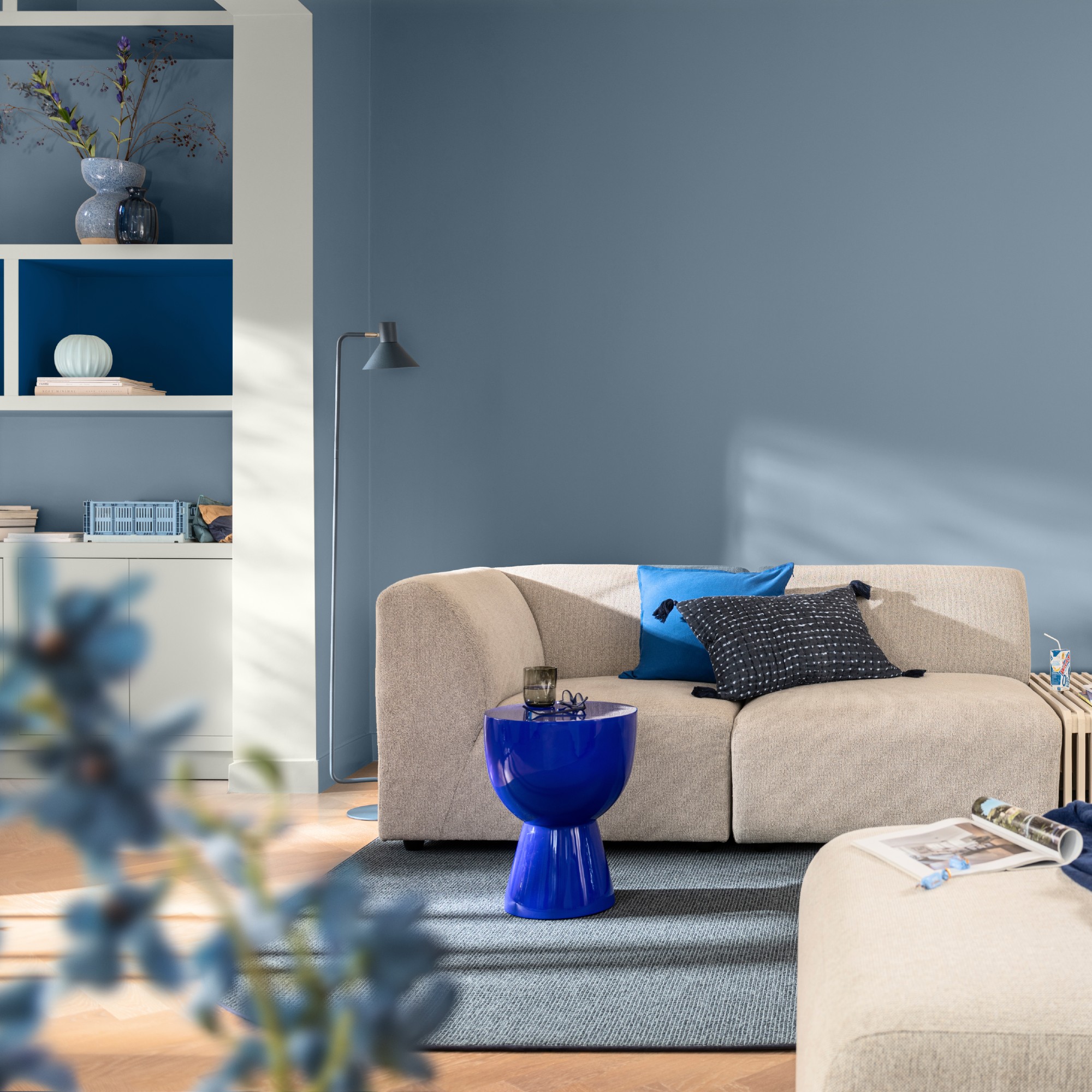
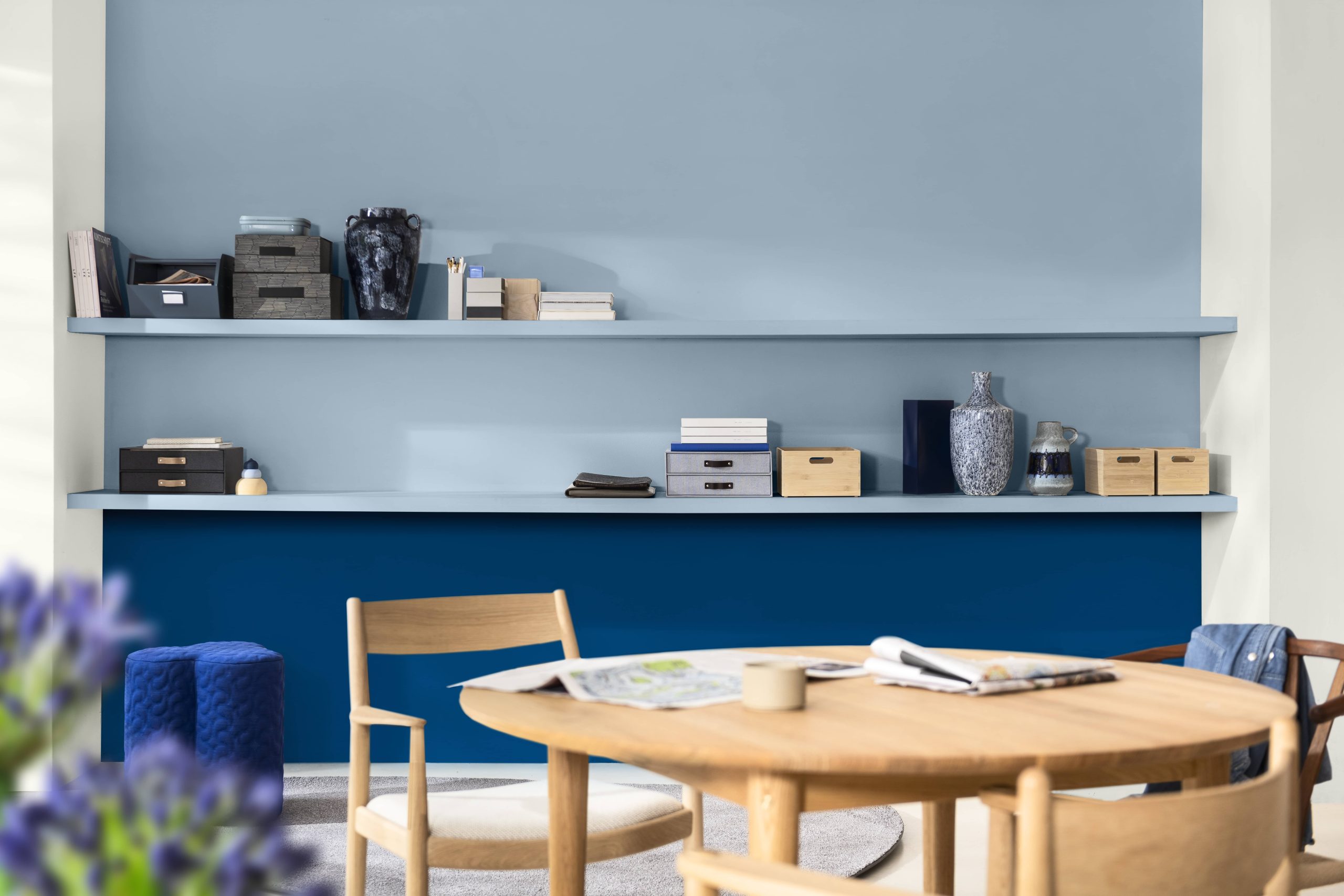
Dulux 2026: The Rhythm of Blues and Design as Emotional Experience
Color as the Silent Signature of High-Level Design
The 2026 color trends confirm that the true value of interior design does not lie in following trends, but in interpreting them with judgment, sensitivity, and strategy. When used with intention, color has the power to transform spaces into experiences, communicate values, and build identity.
At DGLA, color is not a decorative resource, but a conscious decision that reinforces functionality, well-being, and the narrative of each project. Interpreting these trends through an expert lens allows us to create spaces that not only look good, but feel right and endure over time. Because in high-level design, color does not accompany the space—it defines it.

CASE STUDY: HOW A COMPREHENSIVE SPATIAL TRANSFORMATION IS EXECUTED
An analysis of the process behind delivering a comprehensive spatial transformation, exploring how diagnosis, design strategy, and project management translate an architectural vision from concept to execution.
WOMEN DESIGNING THE FUTURE: 5 CREATORS WHO REDEFINED INTERIOR DESIGN THROUGH MATTER AND FORM
On the occasion of International Women’s Day, we explore five designers who have shaped contemporary interior design through pieces developed for renowned European brands. A journey through their formal, technical, and cultural contributions to the evolution of global design.
HOW TO DESIGN ARCHITECTURAL PROJECTS WITH A ROBUST CONCEPTUAL AND OPERATIONAL FRAMEWORK
Design does not begin with a sketch—it begins with a system of thought. This article outlines the mental framework that underpins a rigorous architectural project: the questions that define intent, the analyses that ensure coherence, and the decisions that transform an idea into an operationally sound spatial system.