Color is more than an aesthetic resource: it is a tool that deeply influences our emotions and the way we experience spaces. Choosing a tone for a room is a meaningful decision, capable of transforming a room into a haven of calm or a place full of energy and vitality.
Every year, the leading paint houses conduct an exhaustive analysis of cultural, social and emotional trends to define the colors that will dominate interior design. These selections not only set the aesthetic direction of the sector, but also respond to the needs of a society that seeks spaces that reflect its identity and aspirations.
Incorporating these key colors of 2025 means embracing conscious design, where every choice is an opportunity to create functional and purposeful environments.
The shades proposed for this year are not only relevant from a visual perspective, but also connect with values such as sustainability, innovation and personal well-being.
In this article, we present the chromatic trends that will redefine design in this new year. This guide is ideal for those who want to transform their spaces into more than just livable environments, turning them into authentic expressions of style and meaning.
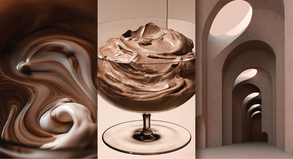
MOCHA MOUSSE BY PANTONE
This is much more than a color for 2025: Mocha Mousse is an invitation to connect with our essence through shades that evoke comfort and sophistication.
*Inspired by the richness of cocoa, chocolate and coffee, this warm brown reflects our longing for simple, comforting pleasures.

Chosen by the Pantone Color Institute, Mocha Mousse redefines earthy tones by combining its classic elegance with a contemporary twist, broadening its perception as a humble color to one that inspires motivation and luxury.
Its ability to integrate into multiple styles makes it ideal for projects that seek to harmonize tradition and modernity. This hue invites you to design environments that not only look good, but also generate a deep emotional experience, connecting people to their surroundings in a meaningful way.
When incorporated in the home, it stands out especially in high traffic areas, such as:
Living rooms: Brings a sophisticated air that invites interaction and relaxation.
Offices: Promotes stability and balance, creating ideal environments for concentration and functionality.
Bedrooms: It favors calm and introspection, promoting a restful rest.
Hallways or entryways: Offers visual continuity with a touch of elegance that connects different areas of the home.


Likewise, its combination with different materials has the capacity to enrich any area, provide depth and stimulate the senses. These can be:
Wood: Reinforces the natural connection and brings warmth to the space.
Linen: Introduces lightness and softness, maintaining a fresh and relaxed atmosphere.
Stone: Brings solidity and a timeless style that highlights the depth of color.
Metallic accents (gold or copper): Add contrast and modernity, elevating the sophistication of the design.
Glass: Balances the intensity of brown with transparency and light, creating a balanced environment.
Mocha Mousse represents an opportunity to reconnect with the essential, to experience luxury in its most discreet and authentic form. Its ability to evoke tranquility and elegance makes it a key trend that will mark a before and after in the interior design of 2025.
SUNBLEACHED POR SHERWIN-WILLIAMS
Sunbleached by Sherwin-Williams emerges as a light neutral that redefines the perception of spaces, balancing warmth and freshness in a sublime way. This grayish tone has the ability to adapt to the environment, offering a versatile palette that stands out depending on lighting and decorative elements.

Its dynamic hue makes it an ideal choice for those seeking a sophisticated and timeless color that can transform any space into a bright and welcoming haven.
The real magic of Sunbleached lies in its ability to play with light and the elements of space, creating environments that flow between modern and classic.

That said, its flexibility makes it perfect for adapting to multiple environments while maintaining its luminous essence:
Master Bedrooms: Promotes tranquility and restful sleep, ideal for a relaxing and cozy atmosphere.
Creative studios: Stimulates concentration and mental clarity by reflecting light evenly.
Common areas: Amplifies the perception of space, creating warm and functional environments for social interaction.

Likewise, there are key materials that when combined have the ability to enhance their impact, such as:
Natural fabrics such as cotton or linen: They soften spaces and reinforce a light, flowing aesthetic.
Marble: Elevate the design with a touch of timeless luxury.
Metallic accents in silver or nickel-plated tones: Counteract the neutrality of color, adding modernity without overwhelming.


This neutral and adaptable shade, when paired with the right materials and spaces, becomes the perfect backdrop for bright and elegant interiors. It is a safe, contemporary choice for those seeking a palette that stands out without overpowering.
BAMBOO 237-05 BY COMEX
This vibrant green, with subtle yellow undertones, connects deeply with nature and its capacity for regeneration.
Inspired by the versatility of bamboo as a material, this shade evokes both strength and flexibility, and acts as a bridge between the past and the future, acting as a tool to reflect on the interplay between the natural and the artificial in an ever-changing world.
Claudia Contreras, Marketing Director of PPG Comex, defines Bamboo 237-05 as an emblem of the balance we seek in contemporary design: “It is a shade that reflects energy, adaptability and renewal, symbolizing our aspiration for a sustainable and responsible future.”
This green also responds to a growing focus on sustainability, fusing technological innovation with environmental sensitivity; inherently inviting designers and inhabitants to think about the impact spaces have on our emotional well-being.

Bamboo 237-05 is ideal for creating environments full of vitality and emotional connection, such as:
Exteriors: Revitalizes the urban landscape with a fresh and natural touch.
Landscaping: Enhances recreational areas and gardens, adding dynamism to green spaces.
Indoor common areas: Brings an air of renovation and modernity to lobbies, lounges and offices.
Sports areas: Reinforces positive energy, promoting activity and movement.


In turn, the richness of this color allows it to be combined with a variety of materials, each amplifying its versatility and adaptability:
Light wood: Provides a warm, natural contrast that highlights the freshness of the green.
Metals in gold or copper tones: Bring sophistication and a contemporary touch.
Textured ceramic: Creates a tactile effect and visual appeal for vibrant interiors.

Bamboo 237-05 is not only a color that beautifies spaces, but a statement of intent: to move towards a more balanced design.
CINNAMON SLATE BY BENJAMIN MOORE
Benjamin Moore introduces Cinnamon Slate as its flagship color for 2025, a velvety shade that combines the richness of plum with deep brown undertones.
This color becomes a symbol of tranquility, capturing the balance between tradition and contemporaneity. Its inclusion in the prestigious Color Preview collection, known for offering a vibrant palette of 1232 colors, highlights its versatility and positions it as an option that transcends trends.
This shade reflects the growing demand for designs that evoke familiarity and understated luxury, making it ideal for transforming spaces into cozy, characterful environments. Cinnamon Slate redefines the use of browns in interior design, showing how these tones can be sophisticated and functional at the same time.
“Colors like Cinnamon Slate respond to an emotional need to create environments that balance the intensity of the outside world with inner serenity,” notes Leatrice Eiseman, executive director of the Pantone Color Institute.

Cinnamon Slate offers a visual richness that adapts to multiple spaces, bringing elegance and character to every application:
Living Rooms: Creates a welcoming ambiance that fosters connection and relaxation.
Dining rooms: Adds sophistication, making it the ideal setting for memorable dinners.
Kitchens: Introduces an innovative contrast to metallic finishes or neutral materials.
The versatility of this tone is enhanced by combinations of materials that enhance its sophistication and functionality:
Gold metals and antiqued bronze: Accentuate its elegance and add a contemporary touch.
Velvet textiles: Emphasize its softness and understated luxury.
Tinted glass: Completes the environment with a modern and refined style.


Cinnamon Slate represents much more than a color; it is an invitation to rediscover spaces through a design that combines emotions and functionality. Its ability to integrate into various contexts makes it an ideal choice for those seeking innovation without sacrificing warmth and elegance in their environments.
SWEET ORANGE BY TRENDO
Trendo’s vibrant Sweet Orange promises to be a major player in 2025, redefining the emotions associated with the color orange in multiple creative disciplines.
Inspired by everyday images of contemporary Mexico, this hue combines unmatched energy with an emotional charge that invites both optimism and reflection. More than just a color, it stands as a symbol of resistance and adaptation in the face of current social and economic dynamics.

This hue not only captures attention, but challenges norms, moving away from the negative perception of “cheap” to claim affordability as a conscious and valuable choice.
Trendo describes it as “dopamine for the wallet,” a metaphor that underscores its ability to connect with creativity, enthusiasm and innovation in an ever-changing world.

Sweet Orange is ideal for energizing and energizing spaces, creating a vibrant contrast that can stimulate creativity and encourage a positive attitude:
Walls and architectural accents: add a bold and memorable focal point in living rooms, studies or recreational areas.
Commercial spaces and boutiques: Conveys accessibility and modernity, ideal for attention-grabbing art installations or temporary projects.
This hue stands out especially when combined with materials that balance its intensity and highlight its vibrant hue:
Exposed Concrete: Provides an industrial contrast that accentuates its boldness.
Satin Metals: Gold and copper add a touch of contemporary sophistication.
Neutral textiles: Such as linen or raw cotton offer balance and visual calm.

This bold tone will be a key tool for designers and homeowners looking to transform their spaces into places full of life and meaning, fusing creativity with a deeply human narrative.


Color has the power to redefine spaces, and at Design Group Latinamerica we integrate it as an essential element to create designs that inspire and excite. Our team masters how to apply these hues, whether it’s bringing vibrant energy, subtle elegance or a balance between functionality and style.
Every project is an opportunity to realize the impact of color, elevating spaces to new levels of meaning. That’s why, this 2025, we look forward to transforming your ideas into memorable spaces: Contact us.